
A review of the POS used to deliver Black Friday 2016
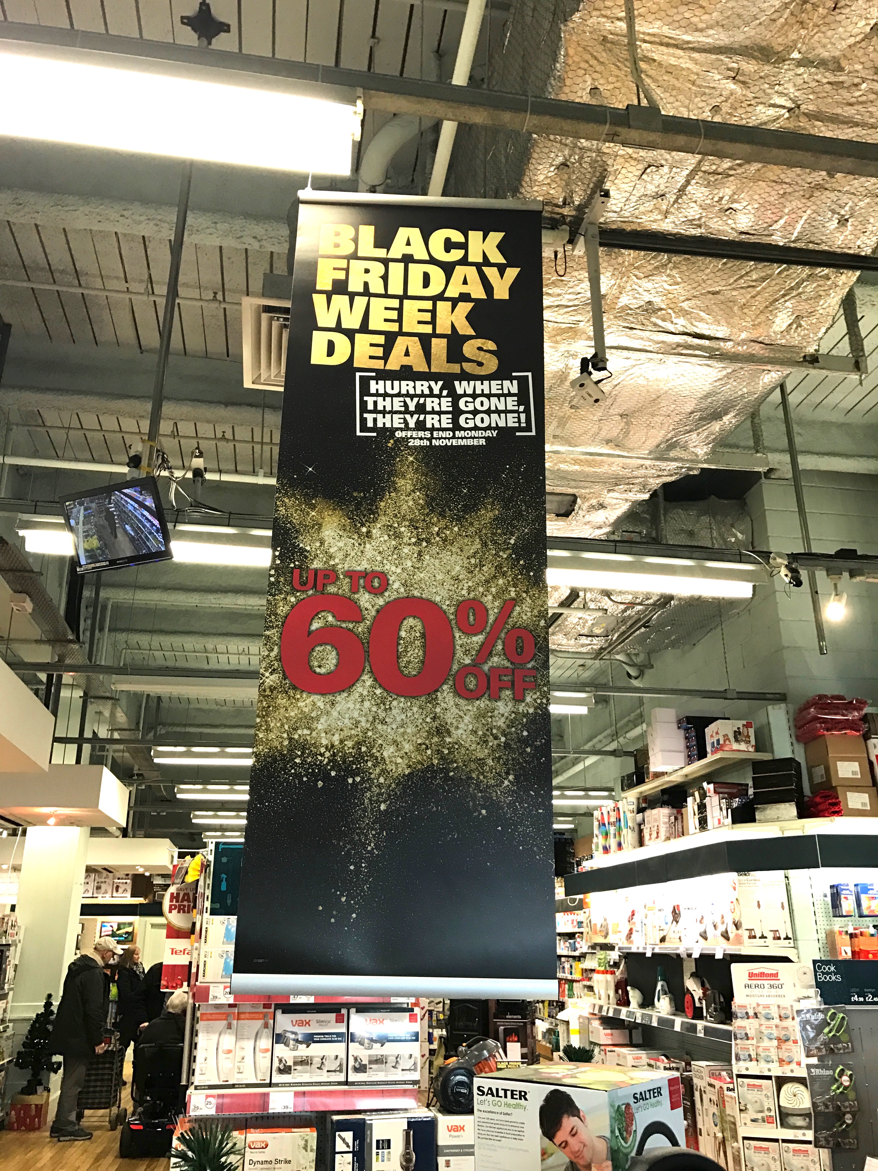
November 29, 2016 4:11 pmBlack Friday is no longer a day-long campaign, which makes use of the term “Black Friday” a dichotomy to work with in POS messaging terms at least. In 2015 we commented that Currys PC World addressed this with the adoption of the more generic term “Black Tag Event” but at the time, few others did.
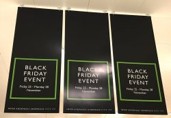
The term “Event” was definitely more widely used this year and it made perfect sense. It worked because the campaign associations were still obvious through the use of dominant black colourways on the creative. Holland & Barrett and to some extent Boots are two examples here.


This promotion is still not encouraging the stretch of 3D engineering or creative skills in a way that might be seen in other seasonal campaigns, though it has nonetheless got slightly more interesting. Take for instance House of Fraser and their use of gold to accentuate quality cues, their simple, cost effective, 2D POS utilised gold sparkle lettering. (M&S did this fantastically well in 2015 – a timely link with the launch of their Sparks card). But it is interesting to compare the House of Fraser use of gold lettering with Robert Dyas’ use of the same. Robert Dyas’ gold was flat, and while it was effective, it didn’t convey quality to the same degree. While this might not have been their intention, it is nonetheless a comparison worth making, as an observation for the future.

More than seen before, retailer’s subtly introduced at least one other colour into their Black Friday POS messaging, their colour choice usually stimulated by brand identity. Tesco and John Lewis are examples here.

Black Friday is still a relatively new, but now established campaign on the British high street. It is therefore a unique opportunity to watch the evolution and direction which POS has taken in its short life span. It is definitely less shouty and less frantic than in years previous and has benefitted from time set aside for reflection and planning. The nature of the campaign has changed too of course, this largely driven by the earlier service delivery issues, so retailers have chosen to stretch the campaign over a longer period of time. Treating this as an Event certainly works better as a key message and the use of black dominating the colour palette retains visual associations with the campaign. A next step to make this even stronger would be to truly tap into the nations fantastic pool of creative talent and see stronger use of visuals and imagery. As shoppers we are not great readers of messaging but we are much more able and willing to identify with and process visual images.
Click here to see a sample of the other Black Friday POS we saw
Categorised in: Black Friday, POS
This post was written by Dawn Odoi


Comments are closed here.